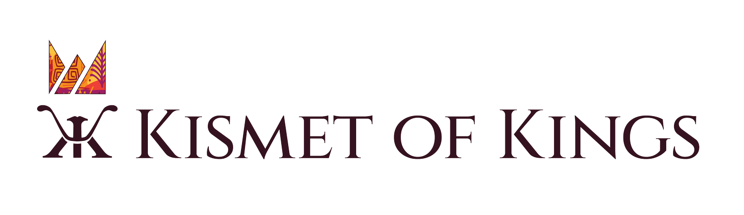
A New Logo for a New Era
In celebration of our 10th anniversary, Kismet of Kings is proud to announce the redesign of our new logo, which visually represents both the values upon which we were founded and the mission we have embraced for the future of our program.
Sitting atop our namesake, the foundation of our new brand mark, are two strong “K”s facing back-to-back in solidarity and support of one another. Together they begin to form the outline of a King’s face; a design that invites our young men to see the full potential of their future selves in the emblem - and the program.
A bold, new crown features angled cutouts representing the two rivers that shape our city. The three resulting segments in turn represent the power of our parents, students, and community all working together to rise up and embrace greatness.
And while the crown's current pattern features African-inspired symbols of strength, endurance, and growth; the interior of the crown itself is meant to serve as an open vessel to be filled by the young Kings themselves. As every young man is unique in his own character, abilities, and dreams; so should be his crown. Every new King that joins the program will be invited to design their own pattern, making the crown his very own - for that is the Kismet of Kings.